The real skill comes in building a PowerPoint that is engaging enough for a narration. Remember you are making a video when you are narrating a PowerPoint, so you should think in visual terms, not textual. Also, when something moves, it catches your attention - in fact, anything that changes focuses your attention. By making animated, rather than static PowerPoints, you will be better able to keep your students engaged in learning.
Here are my tips for designing a more visually engaging PowerPoint.

People have a tendency to put too much text on their PowerPoint slides. This is particularly problematic for narrated PPTs, because people's reading rates are generally much faster than your speaking rate. They can also attend to only one thing at a time. If you have a text heavy slide, people are either going to read the slide and not listen to your narration, or they are going to listen to your narration and not listen to the slide. Either way, something is lost.

How to use that channel? Try using images that support your narration instead of text. In this case, we're really describing the process for creating a narrated PPT, starting with the design, then adding narration, and finally save as a video. In PPT, you can show a process as an image using SmartArt. Here is the same information presented in a process SmartArt:

That's a little better, but it's still static. We can ungroup the SmartArt elements, and then add animations to each element, plus a little WordArt at the beginning to come up with this.

Now we have some motion in an image that supports the idea of a process to designing and narrating and engaging PPT video. Much better than the text-only version, but you can get even more creative. In this case, I added a clip art of a computer screen as the background to my image, changed the format of the SmartArt, ungrouped the elements, modified the colors and the 3D effects, and then added similar animation as in my first animation, but now it just looks more like a video.

This animated image supports the visual channel of communication while my narration supports the auditory channel, and learners are more likely to understand the process behind creating an effective PPT narration.
Now, I'm no PowerPoint expert. I have used it for years, but everything I know I taught myself. I have some basic knowledge, like knowing that SmartArt and WordArt exists, and that you can group and ungroup objects, but everything else I did on that slide was trial and error. I just played around with different effects until I got to something I was happy with. It takes time, but now the next time I want to do something similar, I'll already know what I can and can't do. You have to be willing to play around a little to do something new.

You don't want to narrate an entire 50 minute lecture! No one will watch a narrated PPT for that long, no matter how good it is. Stick to one topic and keep it short, no more than 10 minutes. Remember, you are supporting what students have learned from the textbook, not repeating it. You are better off doing two or short videos and give students something with each one (like a discussion or an assignment) rather than doing one long video with no guided viewing purpose. it is easier to promote active learning with shorter videos as well, rather than one long one.
So that's one topic per video, nothing more. For example, if I were creating videos for a lesson on the information processing model of memory, I might do one as an introduction, one covering sensory memory, one covering short-term or working memory, one covering long-term memory, and then one that traces an example through the entire model. That's five videos, and each would be no more than five minutes long, but they are focused and sequential, and I can follow up each with a few questions each student must answer in an assignment, or a discussion after viewing all five. They are more likely to watch five short videos than one long one, and the addition of an assignment or a discussion promotes active learning.

In addition to keeping it short, keep to one point per slide. Each of my "tips" here are actually images from a PowerPoint I created for the live Teach Me Tuesday session. The "traditional" text-based method might list all five points on one slide, with selective reveals as I discuss them. but that pulls focus from the point I want to make. If I'm talking about "One point per slide" I don't want to distract you from that by including anything else on the slide. Using images for dual channel processing helps you keep to only one point per slide, as well. Information processing theory says people can only attend to one thing at a time, so help your students focus on what's important by keeping to one point per slide.

I've seen a lot of publisher PowerPoints in my day, and that vast majority of them are very bad. They tend to be text heavy, with images pulled straight from the textbook, and no animation. They do make a good outline of a textbook chapter, though, and that's how I use them in my online classes. I save them as a PPT handout PDF and tell my student to use them to take notes as they read the textbook. If you're going to take the time to narrate your PPTs, take the time to make your own. Don't duplicate what's in the textbook; expand on the important points or add new information the textbook lacks. Make use of the animation techniques in PowerPoint and use images and text for dual channel processing, and you will get much better results for your
Here's an example from the publisher PPTs for my astronomy course. This is the slide explaining what parallax is:

So many things wrong with this... The image is straight out of the textbook, so it's just a duplication of effort to use it in a narration. It would be better to use a different, active image. There is also way too much text on the slide. While it might be a good outline of the chapter content, it would pull focus from what I'm trying to explain in my narration.
I can easily create an animated slide explaining the same thing:

By using the animation effects, the image now is more active, and appears as a step by step process I can describe rather than as a complete photo where I have to try to get them to focus on one aspect.
Here's another example:

Same problems, just twice as much! Again, the images are from the textbook, they're static, and they are too hard to read! Here is the animated version, where I make use of the PowerPoint pen tool during narration:
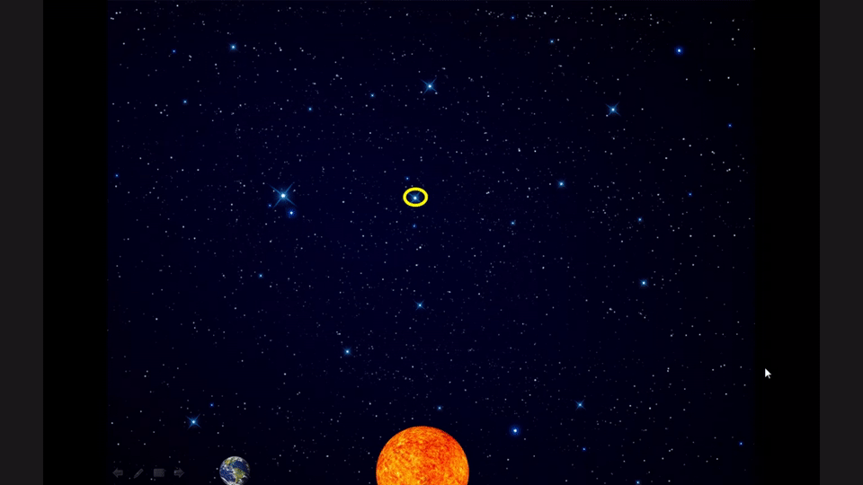
By making my own animated image, I can focus on the concepts that I want students to understand. Since this is a descriptive astronomy course, that means dropping out most of the math, and leaving just the simple inverse relationship at the end. Then I can embed my narrated PPT about parallax into a discussion and ask some important questions in a group discussion, like will the parallax be bigger or smaller for more distance stars, and if the smallest angle of motion we can measure is about 0.05 degrees, then what is the distance of the furthest star we can measure by this method. Then that will lead into the next topic of measuring greater distances - which would be covered by a new PPT, using the keep it short tip and sticking to one topic per PPT.
(Actually, in looking at this now, I could make it even better by removing the first Earth position and arrow when I'm done with them, but leave the ink mark showing the apparent star position. Then I can focus on the parallax angle...creativity is an iterative process!)
Now that you have your well-designed PowerPoint, you're ready to start narrating...well, almost. I'll cover that process in my next post and give you some tips for narrating your PowerPoint.
No comments:
Post a Comment